
Martin
Founder, strategy and audits
Writes every audit and takes every first call. On your account from day one, running growth for SMEs since 2010.
A MedSpa site has about as long as a glance at reception to make its case. It must look calm and premium, show the treatments, explain memberships and let someone book in a few taps. We design MedSpa sites around the booking: beautiful on a phone, quick to load and clear about what happens next.
For MedSpas whose site looks good but books poorly, or looks dated next to competitors, and who want more visits from the same traffic.
Context from how your customers search, compare and book.
A visitor lands from Instagram or a map listing with one question: can I book this tonight? A site that opens with a slow video, a long story and a hidden booking link loses her. The first screen should show the feel of the place and a clear way to choose a treatment and a time.
Menus can overwhelm. Grouping treatments into faces, skin, body and hair removal, with a short line on each and a price cue or from-price where you choose to show one, helps clients find their way. Each treatment page then explains the visit, aftercare and who delivers it.
Membership and gift card pages are revenue pages. A member plan needs clear terms, what is included and how to pause. A gift card page needs a fast purchase flow that works on a phone. Both should be reachable from the main menu, not buried at the bottom.
Proof comes from reviews, the team and the space. Photos should be real, with consent, and the clinical lead and practitioners should be named. A short first-visit guide eases nerves for newcomers, and a text or chat button helps clients who would rather not call.
A clear, repeatable process built around how medspas & aesthetic medicine customers search and decide.
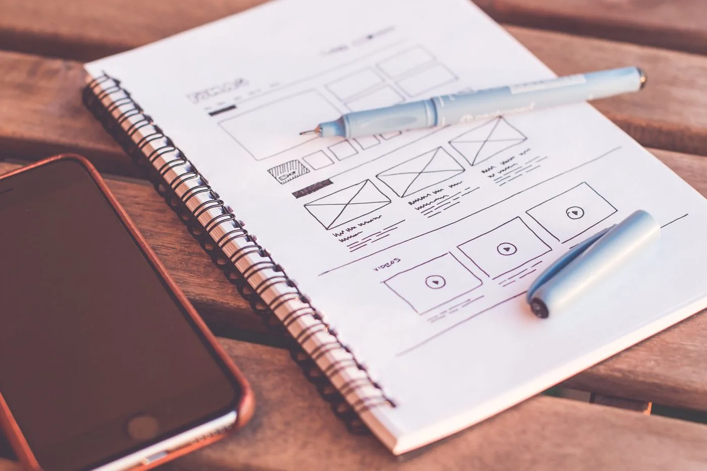
We start with how you want the business to feel and which treatments pay best. Then we group the menu, plan the membership and gift card paths, and draw a site map. You see the map and sample screens before the build begins.
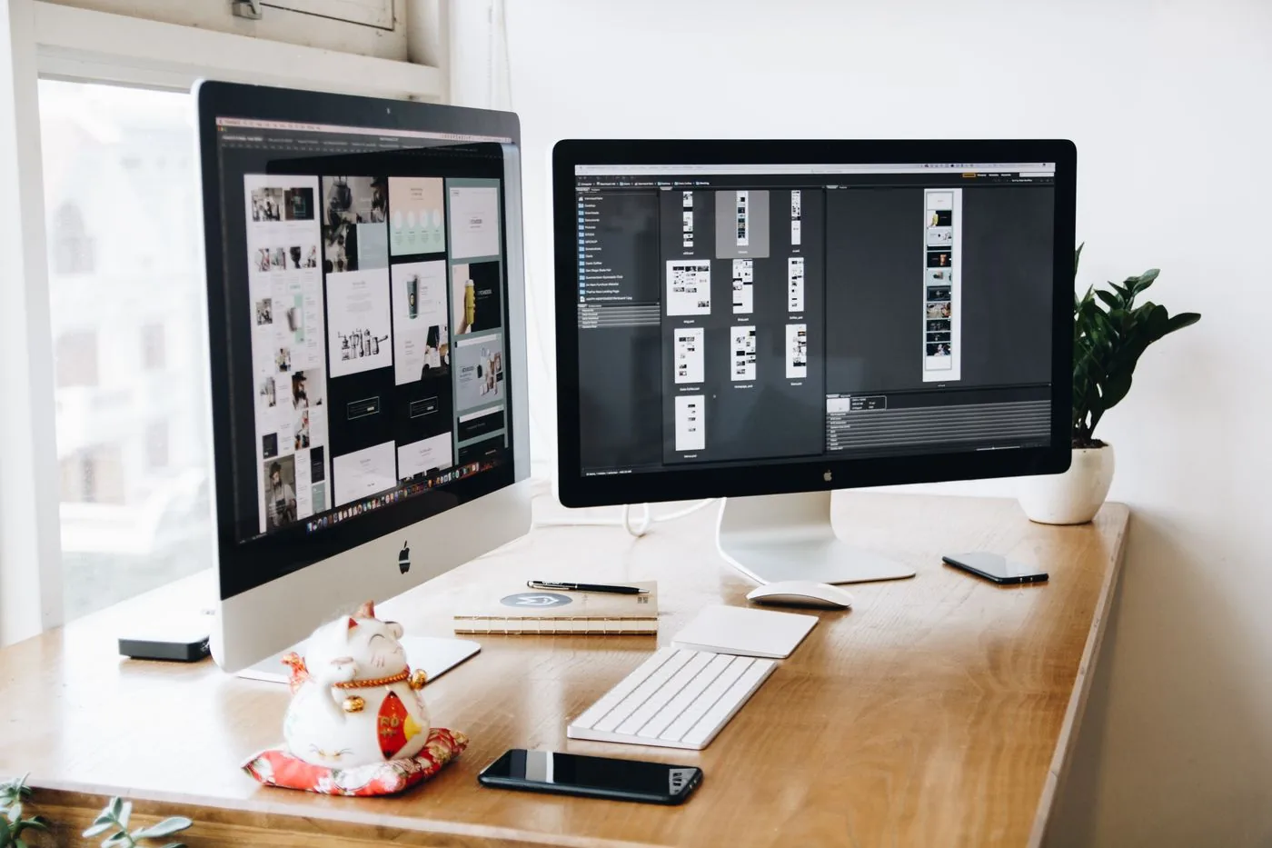
The first screen shows the atmosphere and a primary booking button. Treatment pages share one layout: what it is, how it feels, who delivers it, aftercare and booking. New treatments can be added without redesign.
We connect the site to your booking software so each treatment button opens that exact service. Text, call and message buttons sit beside it. We test the full path on phones, from first tap to confirmation.

A membership page explains tiers, inclusions and how to pause. A gift card page lets a buyer choose an amount and send it in minutes. Each location gets a page with address, hours, parking notes, team and map.

After testing on a range of phones and connections, the site goes live with redirects from old addresses. In the following weeks we look at where visitors stall in the booking path and smooth those points.
Pages that make it easy to understand the offer and take the next step

The mechanics behind Web Design for medspas & aesthetic medicine, explained plainly.
Premium photography is heavy. We compress and size every image, load galleries on scroll and play video only on request. The booking button renders first, so a client can act before the page has finished loading.
Analytics record each step: treatment viewed, booking button tapped, booking finished. A drop between steps shows where visitors stall. Calls, texts and gift card sales are tracked too, tagged with the page and source that led to them.
Contrast, text size, headings and image descriptions are set so everyone can use the site. Cookie and consent banners follow local rules. Client photos are used only with written consent, and forms request only what is needed to reply.
MedSpas & Aesthetic Medicine web design starts at $2,000. Scope depends on how many pages and features you need, and we agree it with you after seeing your current site.
What's included
The pages customers need to decide, laid out for phones first, with proof and a clear next step.
Forms and call buttons that work on every phone, with each request tracked to its source.
Image, speed and mobile checks before launch, and a short list of fixes afterwards.
Larger builds, such as online shops or booking systems, are scoped after discovery. Talk to us for a fit.
A booking-first site depends on a clear plan more than on long builds. The order is workshop, layout, integration, testing and then small improvements from real use.
The workshop settles brand, menu and membership structure. You share photos, practitioner details and booking system access. First screens for the homepage and a treatment page arrive for comment.
The site is built, connected to bookings and tested on phones. Membership, gift card and location pages are completed, issues are fixed and you give the final sign-off before launch.
Once real visitors arrive, we study the booking path and refine buttons, order and wording. A website cannot promise bookings, but it can remove the small frictions that cost them.
Our team
Martin writes every audit and takes the first call. The same team stays on the account. 160+ businesses since 2010.
Founder, strategy and audits
Writes every audit and takes every first call. On your account from day one, running growth for SMEs since 2010.

Social and app development
Shapes social strategy and builds practical app experiences that turn attention into action.

SEO
Owns technical, local and content SEO so the right buyers find you when demand is highest.

Paid media
Plans and manages paid search and social campaigns around qualified leads.

Analytics
Connects tracking, attribution and reporting so decisions are based on revenue-quality data.

Design
Creates clear brand and conversion-focused design across landing pages, campaigns and product experiences.
Certified and experienced
Verified platform knowledge, 25+ years of hands-on experience, and an operating track record since 2010.
Get a free audit and we will show you where you are losing inquiries today.
Get a Free Audit arrow_forward