
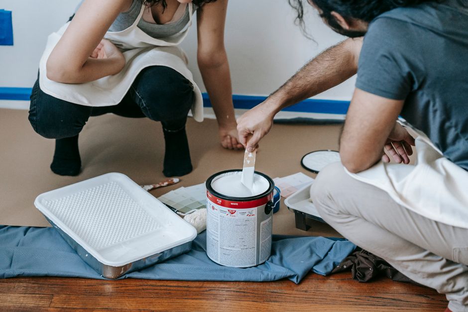
A homeowner in Plano finishes work, opens her phone, and types “exterior house painters near me.” She is not browsing for inspiration. She wants three solid quotes before the weekend, preferably from crews who show up when they say they will and carry real insurance. She taps the first ad, waits on a slow hero image of a perfect porch, then hits a vague “Learn more” button that dumps her on a homepage with six service menus and no clear next step. She bounces. The second result loads fast, names the city, shows three recent jobs with streets she recognizes, and asks for zip, surface type, and preferred start window. That one gets the form fill.
That gap is the whole game for landing pages for painting companies in the US. Pretty pages win design awards and stall booked jobs. High-converting pages look a little less gallery-like and a lot more like a job ticket the estimator can actually work. If you run Google Ads, Local Services Ads, or SEO for interior, exterior, cabinet, or commercial painting, the page after the click decides whether you pay for a tire-kicker or a calendar slot.
This piece contrasts what books work against what only fills forms or burns CPC. It stays on web and landing page design for US painting operators: proof, mobile speed, form friction, trust, and the behaviour data that shows where people quit.
Painting companies that work in Omaha can compare their own website against the high-converting page elements described in this guide. Project galleries, quote forms that respect a homeowner’s time, and clear service areas drive inquiries in any market, while decorative pages without those elements tend to stall. Target location: Omaha. Owners who run this trade there can use the Omaha home services page for market notes before redesigning their pages.
Why US painting traffic dies on “beautiful” pages
Painting buyers in markets like Dallas, Phoenix, Atlanta, and Chicago move fast and compare hard. Interior repaints often sit in a two-to-four week decision window. Exterior jobs cluster around weather, HOA rules, and “before the holidays.” Property managers want a certificate of insurance, a crew size, and a start date, not a brand story. When your page leads with lifestyle photography and soft copy, you look premium and unbookable at the same time.
The failure mode is almost always the same. Paid search or SEO sends high-intent traffic to a homepage or a template service page that tries to cover every surface, every city, and every finish. The headline talks about “transforming spaces.” The form asks for a full project essay. Mobile load drags past three seconds because of uncompressed before-and-after galleries. Trust signals sit in a footer nobody scrolls to. You still get some form volume, so the dashboard looks fine until the estimator reports that half the leads never answer and a third wanted a different trade.
US painting also has a proof problem competitors in other home services feel less sharply. Anyone can claim “licensed and insured.” Homeowners have been burned by no-shows, thin paint jobs, and surprise change orders. If your page does not show recent local work, named service areas, review volume, warranty language, and a concrete response promise, you force the buyer to keep shopping. That is how you pay $8-$25 a click for “house painting quote [city]” and still lose the job to the crew whose page answered the estimator’s questions first.
Another quiet leak: one generic page for every offer. Cabinet refinishing, HOA exterior bids, multi-unit property managers, and “paint one room this weekend” DIY-adjacent shoppers do not convert on the same layout. Pretty global templates flatten intent. High-intent campaigns need pages that match the query and the offer, not a single polished brochure.
If you are already spending on search and the calendar is still lumpy, audit the handoff before you raise budget. Dedicated web and landing page design built around booked estimates beats another round of ad tweaks on a page that stalls.
What high-converting painting pages actually put above the fold
Start with the job the visitor is hiring you for, in plain US contractor language. “Exterior painting in Houston - free on-site estimate within 24 hours” outperforms “Crafted color, lasting beauty.” Name the city or metro when the campaign is local. Put the primary CTA in the first screen on mobile: Get estimate, Book walkthrough, or Text us photos. Secondary links can wait.
Proof belongs early, not in a buried gallery. Use three to six real job photos with short captions (neighborhood or surface, not stock). Pair them with review counts and a line on insurance, licensing, and warranty. Property managers scan for COI language and commercial experience. Homeowners scan for “we move furniture / we protect floors / we handle HOA color packets.” Put those claims where thumbs land, not in a PDF brochure.
Form design is where pretty pages quietly tax you. Long “tell us everything” forms feel thorough and kill completion on mobile. For most residential painting leads, ask zip or city, project type (interior, exterior, cabinet, commercial), approximate size or room count, timing window, and phone or email. Offer photo upload as optional, not required on step one. Promise a human response time you can keep - same day or next business morning beats “we will be in touch.” Speed-to-lead still decides who gets the walkthrough when three painters all got the same form fill.
Offer clarity matters as much as design polish. Free color consult, fixed-scope interior packages, or “exterior bid with written scope in 48 hours” gives the visitor a reason to choose you over the next SERP result. Vague “contact us for pricing” forces work onto the sales call and drops weaker mobiles. Match the landing headline and offer to the ad or SEO title word for word. Message match is still one of the cheapest conversion lifts in paid search for trades.
Technical basics are not optional in 2026. Mobile drives most paid clicks, and conversion still lags desktop when pages are heavy. Compress galleries, lazy-load below-the-fold images, keep scripts lean, and watch Interaction to Next Paint across all interactive elements, including form fields and gallery controls. Roughly half of origins fail at least one Core Web Vital in recent CrUX snapshots (web.dev). Painting sites stuffed with uncompressed portfolio shots are often on the wrong side of that line. A fast, slightly simpler page books more work than a slow showcase.
Track the outcomes that matter to the shop, not vanity form counts. Fire conversions on qualified estimate requests, and use call tracking on click-to-call. Tie source to booked walkthroughs and won jobs in whatever CRM or job board you use. Landing alignment is part of that waste, not a separate “design” problem.
Get a free marketing audit - we review your search, ads, and landing pages and send back what to fix first.
Get a free audit
Pretty page patterns that waste budget vs pages that book crews
Pretty pages optimize for brand impression. Converting pages optimize for the next operational step: a scheduled estimate the production manager can staff. Here is how those paths diverge for US painting companies.
Hero and headline. Pretty: full-bleed lifestyle shot, logo-centered, abstract tagline. High-converting: service + geo + outcome in one line, CTA visible without scrolling, supporting line on insurance and response time. The second version looks less “agency” and books more exterior seasons.
Navigation. Pretty: full main-site nav with Blog, About, Careers, eight service dropdowns. High-converting paid landing: stripped nav or single logo, one exit path, focus on the form. Every extra link is a leak when CPC is real money. SEO service pages can keep light nav, but still lead with proof and CTA before the essay.
Social proof. Pretty: a carousel of five-star widgets with no dates or locations. High-converting: recent Google review snippets that mention punctuality, prep work, or clean job sites; photo proof from the same metro; logos or notes for builders and property managers if that is your lane. Specific beats polished.
Forms and contact. Pretty: multi-field “project vision” questionnaire plus required budget and square footage before anyone can submit. High-converting: short path, optional photo upload, click-to-call sticky on mobile, SMS option if your team actually texts back. Friction should filter junk, not punish tired homeowners on a phone at 9pm.
Content depth. Pretty: long brand manifesto, team bios first. High-converting: scannable scope (what is included in a standard interior repaint, how exterior prep works, how you handle color changes), FAQs on dust, pets, lead-safe practices where relevant, and clear service area lists. Depth supports SEO and late-stage trust; it should not bury the ask.
Painting unit economics vary by ticket size and close rate, but the pattern holds: traffic quality without page quality is an expensive hobby. If someone says they will “just send traffic to your homepage,” treat that as a red flag. Dedicated painting marketing pages aligned to each intent cluster protect margin when CPCs climb.
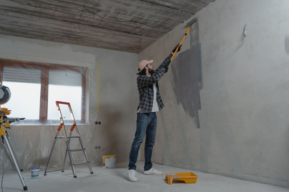
Painting landing page examples: two US page fixes that booked more estimates
Scenario one: One HeyLead client-a three-crew exterior shop outside Phoenix-running Search ads into a beautiful homepage. CPC sat in the low teens on “house painters Phoenix,” form volume looked healthy, and booked estimates lagged. The mechanism was simple. The homepage hero rotated stock images, the primary button went to a generic Contact page with eight fields, and mobile LCP dragged past four seconds on portfolio tiles. Estimators were calling leads who had already hired someone faster.
What changed:
-
Built a dedicated exterior landing page with geo in the H1, COI and warranty lines above the fold, and three recent stucco and HOA jobs with city names in captions.
-
Cut the form to zip, stories (1 or 2+), timing, and phone; added sticky click-to-call.
-
Compressed images, deferred non-essential scripts, and matched ad RSA headlines to the page H1.
-
Started reviewing session recordings weekly to catch rage taps on the old gallery lightbox that still linked from ads for a week.
Booked walkthrough rate on paid traffic moved from roughly 11% of form fills to just over 27% in about five weeks. Spend stayed flat. The “pretty” homepage remained for brand browsers. Paid stopped feeding it.
Scenario two: a Chicago interior and cabinet shop with solid organic rankings for “cabinet painting Chicago” but weak lead quality. The SEO page ranked. Visitors scrolled the long process essay, opened the price FAQ, then left without contacting. Heatmaps showed deep scroll on content and almost no engagement with a footer form. The fix was not more blog posts. It was a mid-page estimate module after the first proof block, a shorter “cabinet only” path, and a side-by-side of factory finish vs on-site refinish with realistic timelines. They also added a line for condo and building rules, which property-adjacent buyers needed before they would share a phone number. Organic estimate requests from that page roughly doubled over two months, and estimators reported fewer tire-kicker calls that stalled on building rules after the first conversation.
You do not guess these leaks from GA4 totals alone. Watch the tape. HeyLead Insights (session recordings, heatmaps, scroll depth, form abandon, click patterns) shows whether people stall on slow galleries, miss the CTA under a tall menu, or start the form and drop on a required square-footage field they cannot answer from the couch. One afternoon of recordings usually beats another month of opinions about button color.
If your team is mid-rebuild, fix the highest-spend intent first: exterior season keywords, interior whole-home, then specialty (cabinets, commercial). Clone winning structure across cities instead of reinventing a new pretty layout per market.
Patterns we see in audits
The short quotes below are illustrative composites drawn from patterns in account reviews. They are not quotes from named clients.
A Texas painting owner described exactly this situation to us: gorgeous portfolio, $9k/month spend, estimators complaining about lead quality. Once they split exterior pages by metro and cut the form to five fields, same spend produced far more Tuesday walkthroughs - the fancy homepage was the leak.
A Southeast US residential painting marketing lead walked us through recordings that showed people tapping the phone number in an Instagram bio creative, then landing on a page where click-to-call was buried under a 3MB slider. They fixed that one thing before touching bids.

Free tools
DIY free tools for this playbook
Run these on the pages and campaigns this article covers, then fix what they flag before you scale spend or content volume.
Run these on this playbook
If the checklist shows a leak you cannot close in-house, request a free marketing audit.
Frequently asked questions
Do painting companies need separate landing pages for Google Ads and SEO?
Yes for paid, usually. Paid should use focused pages with reduced nav and message match to the ad group. SEO service pages can rank with richer content, but they still need early proof, fast mobile load, and a short path to an estimate. Sharing one bloated homepage for both is how pretty layouts stall expensive clicks.
How long should a painting estimate form be?
Short enough to finish on a phone in under a minute. Zip or city, project type, rough scope, timing, and contact method cover most residential cases. Save detailed measurements and full photo sets for the estimator follow-up. Optional uploads beat required ones on first touch.
What proof actually moves US homeowners and property managers?
Recent local job photos, specific review language about prep and reliability, insurance and licensing stated plainly, warranty terms, and a response-time promise you keep. Property managers also look for multi-unit experience and easy COI handling. Generic stock galleries do not replace that.
Where does behaviour data fit if we already watch conversion rate?
Conversion rate tells you the score. Recordings and heatmaps tell you the play that failed. For landing pages for painting companies, that usually means slow image weight, CTAs below endless portfolios, or form fields that force guesswork. Fix the friction you can see, then re-check booked-job rate, not just form count.
Should we show pricing on the landing page?
Full fixed pricing is hard for custom painting, but ranges, package starting points, or “typical 3-bed interior repaint” bands reduce tire-kickers and set expectations. If you will not publish numbers, publish scope clarity and what drives change orders so the lead is educated before the visit.
Putting it to work
Pull your top five traffic sources for painting estimate requests from the last 60 days, open those URLs on your phone over cellular, and time how long it takes to find a clear CTA, a local proof block, and a form you would actually finish. Note every extra field and every gallery that blocks the ask. Fix the worst offender first: shorten the form, move proof up, match the headline to the query, and watch three or four session recordings on that URL before you touch bids again.
When you want a partner to own the full rebuild and ongoing CRO on those painting landers - proof structure, mobile performance, form logic, and behaviour review so high-intent traffic stops dying on pretty layouts - HeyLead runs that web program end to end. Call us.
Free marketing audit, or reach Martin directly:
Get a free audit Chat with us on WhatsApp · [email protected]