
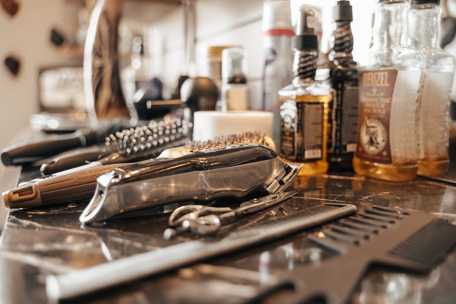
Friday arvo in Brunswick. A bloke finishes work, opens his phone, and types “skin fade near me” before he even hits the tram. He is not browsing mood boards. He wants a chair tomorrow morning, a clear price band, and proof the shop can actually cut his hair type. If your page loads like a lookbook, hides the booking path under three taps, or talks about “craft” without showing a single recent fade on a client who looks like him, he bounces and books the place two suburbs over.
That is the real market for landing pages for barbers australia: high-intent local demand that either locks a seat or dies in three seconds. Pretty pages stall. High-converting ones book work. The gap is not taste. It is proof, speed, friction, and whether you can see where people drop off before you throw more ad spend at the same dead end.
Where Australian barber traffic actually comes from (and why the homepage wastes it)
Most of the money that walks into a good shop in Sydney, Melbourne, Brisbane, or the Gold Coast starts as a narrow job. Skin fade. Beard shape. Kids cut before school. Walk-in today. Someone already decided they need a barber; they are ranking options by distance, reviews, photos, and how fast they can confirm a time. Google Business Profile, branded search, and local paid search all feed that same intent. Meta can fill the top of the funnel with reels of a clean taper, but the click still has to land somewhere that finishes the job.
Plenty of shops still send that traffic to a homepage built like a brand film. Full-screen video of clippers in slow motion. A carousel of the fit-out. A menu buried under “Services” with no price cues. A “Book now” button that opens a third-party widget after a five-second spinner. On mobile (where most of this traffic lives) that pattern feels polished and converts poorly. You paid for intent. The page spent it on atmosphere.
High-intent searches and paid campaigns produce booked work when the landing message matches the query and the next step is obvious. A man who clicked “barber open late Perth CBD” should not land on a generic studio story. He should see late hours, the CBD pin, live or near-live availability, and a short form or one-tap call. When agencies or in-house teams “just send traffic to the homepage,” you get forms from tyre-kickers and silence from people who would have paid $45-$70 for a cut if the path had been clearer.
Response speed matters after the click too. A form sitting unanswered for four hours on a Saturday is almost the same as no form. Many Australian barbers still treat the diary as a walk-in board and the website as a brochure. The shops that stay full treat the page as a front-of-house staffer that works overnight: capture the intent, confirm the offer, and get a human on it before the bloke finds another chair.
Pretty pages that stall: what burns budget without filling the diary
A stalling barber page usually fails in a few repeatable ways. First, weak proof above the fold. Stock photos of generic salons, or only the owner’s best three cuts from 2022, do not answer the visitor’s private question: “Can you do my hair?” Australian clients scan for fades on different hair textures, beard work, and whether the shop looks busy with people like them. If that proof is three scrolls down, you already lost the mobile visitor.
Second, form friction dressed up as “premium UX.” Multi-step booking with account creation, long questionnaires (“How did you hear about us?” before time slot), or a widget that demands an app download will crush conversion on a $35-$55 service. You are not selling enterprise software. You are selling 30-45 minutes in a chair. Every extra field is a reason to call the shop that still lists a phone number in big type.
Third, slow mobile performance and heavy design. Full-bleed video autoplay, unoptimised image galleries, and third-party chat scripts stack up. Only a bit over half of sites pass all three Core Web Vitals in recent CrUX data; barber sites with lavish galleries are often on the wrong side of that line. When Interaction to Next Paint drags, the Book button feels broken even if it works. Paid search makes this expensive fast: you pay for the click, then the page taxes the click again.
Fourth, vague offers and buried pricing. “Premium grooming experiences” without a starting price, package names that mean nothing outside the shop, or a PDF menu only available in-store all create the same stall. Locals will tolerate a range (“fades from $45”) more than a mystery. If GST-inclusive pricing is the norm on the street, mirror that on the page so nobody feels ambushed at the till.
Fifth, no closed loop on what the page did. If you cannot tell which campaign, which service block, and which device produced a booked cut versus a no-show enquiry, you will keep polishing the wrong section. Pretty pages love aesthetics reviews. High-converting pages love behaviour evidence: where thumbs stop, which photo gets the pinch-zoom, and which field empties the form.
If your ads or local SEO are already sending people and the chairs still sit empty midweek, a focused pass on web and landing page design usually pays faster than another creative refresh on the same weak URL.
What high-converting barber pages prove in the first screen
A page that books work in Australian barber markets does a short list of jobs before the visitor scrolls. It names the service in plain language that matches the search: skin fade, scissor cut, beard trim, kids cut, hot towel shave. It shows the suburb or corridor you actually serve (South Yarra, Parramatta, Fortitude Valley) so people know they are not about to drive across the city for nothing. It puts a primary action in thumb reach: Book, Call, or both, with call weighted heavily for same-day intent.
Proof sits next to the action, not in a distant gallery. Recent phone photos of real clients beat studio lighting. Star rating with volume beats a solitary “best barber” badge. A one-line policy on walk-ins versus appointments reduces argument at the door. If you take card, Afterpay, or cash only, say it once. If parking is a nightmare and the tram stop is outside, that line saves no-shows more than another hero slogan.
Service blocks should read like a menu, not a brand manifesto. Group by job, show a from-price in AUD, and link each block to a short form pre-tagged with that service. That alone cleans your lead quality: you stop getting “general enquiry” when the person wanted a beard only. For multi-location groups, separate landing pages per suburb beat one mega-site with a location dropdown that resets on mobile.
Trust signals that land in this niche are operational, not corporate. Trading hours including late nights. Hygienic cues without overdoing clinical language. Named barbers with a specialty (“tight fades, curly hair”) so regulars can rebook the same hands. Review snippets that mention punctuality and consistency, because a bad wait ruins a good cut in local word of mouth.
Tracking belongs under the hood from day one. Call tracking numbers on the landing page, thank-you events on booking complete, and UTMs that survive the booking tool redirect. Without that, Google Ads and Meta will optimise toward whatever noisy event you gave them, and you will swear the channel “does not work for barbers” when the page never told the algorithm what a real booking looked like.
Shops that want this built as a program rather than a one-off template often start from a niche view of Barbers marketing, then harden the page against the exact queries and ads already spending money.
Get a free marketing audit - we review your search, ads, and landing pages and send back what to fix first.
Get a free audit
Mobile speed, form design, and watching abandon in the wild
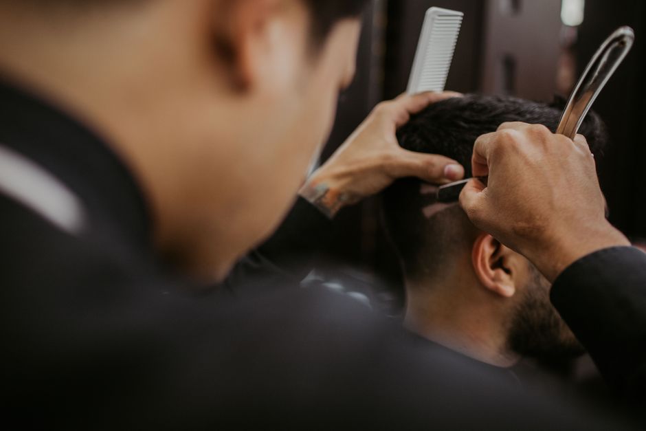
Most barber visits on a phone happen in messy contexts: on the tram, in a work bathroom, between jobs. Your page has maybe two seconds of goodwill. Compress images of cuts without turning them to mush. Lazy-load the deep gallery. Kill scripts you cannot name. Make the tap targets fat enough for a thumb on a moving bus. If the booking embed is slow, host a lightweight “request a time” form on your domain and let staff confirm in the real system. A slightly manual back-office step beats a perfect widget nobody finishes.
Form design should respect the ticket size. Name, mobile, preferred service, preferred daypart. Optional notes for “leave the top long.” That is enough to dial back and lock the chair. Skip newsletter opt-ins on the first step. Skip CAPTCHA walls that fail on older Androids. If you must collect card to hold a peak Saturday slot, explain the hold fee in one honest sentence; surprise deposits create chargebacks and one-star reviews.
Guessing where the page leaks is how pretty redesigns get approved and then underperform. Behaviour data fixes that. Session recordings and heatmaps show whether people rage-tap a non-clickable price list, stall on a full-screen cookie banner, or abandon when the booking calendar defaults to a month with no availability. HeyLead Insights is built for that on-site picture: scroll depth, form abandon, and click patterns so you change the block that actually breaks intent instead of debating logo size in a group chat.
Pair that view with basic analytics hygiene. Separate landing page paths for “fade” versus “beard” campaigns. Watch mobile conversion against desktop without averaging them into a comforting lie. When paid search CVR lags, check the landing experience before you blame match types. A large share of paid clicks is mobile; if your mobile conversion trails desktop by a wide margin, the creative is rarely the only culprit.
Iterate in small cuts. Swap proof images. Shorten the form. Move hours higher. Test a click-to-call sticky bar after 6 p.m. local time. Keep the brand personality, but stop letting personality sit on top of the booking path. The shops that win treat the page like a chair: if it is empty, something in the setup is wrong, and you fix the setup with evidence.
Two Australian shop scenarios where the page, not the ads, fixed the week
A two-chair shop in western Sydney was spending modestly on search for “barber near me” and “skin fade Blacktown.” Clicks looked fine. The diary did not. The landing URL was the homepage: a 12-image slider of the fit-out, a story about the owner’s apprenticeship, and a Book button that opened a third-party tool after a long load. Staff assumed “leads are low quality.” The mechanism was simpler. Mobile visitors never reached the book control; they pinched the first two photos and left.
The fix was a dedicated fade landing page with four recent client photos (including thicker and curlier hair), a from-price, suburb proof, and a four-field form that SMS’d the owner. Call button stayed sticky. Within roughly 11 days the same campaigns produced confirmed Saturday slots instead of anonymous form spam. Ad copy barely changed. The page finally finished the sentence the ad started.
Second case: a Melbourne CBD shop running Meta traffic from short fade reels into a “pretty” services page with no price anchors and a multi-step booking account wall. Reel CTR was healthy. Cost per completed booking was ugly. Heatmaps showed heavy tap activity on the muted price list image (people thought it was a button) and drop-off on step two of account creation. They replaced the image with real HTML prices, killed forced accounts for first-time guests, and added a same-day call path for lunch-break cuts.
Completed bookings rose without increasing daily ad spend. The honest admission from the operator side was that they had been optimising hooks while the landing experience asked a tired office worker to join a membership flow for a $50 cut. Creative still mattered. The page stopped taxing every click.
-
Match one primary service per landing URL to the ad or search theme.
-
Put proof, price cue, hours, and action in the first screen on mobile.
-
Prefer short first-party forms when third-party bookers add friction.
-
Watch recordings weekly until the main abandon points go quiet.
-
Only then scale spend; pouring budget on a stalling page just buys more stalls.
Patterns we see in audits
The short quotes below are illustrative composites drawn from patterns in account reviews. They are not quotes from named clients.
“We kept blaming Google for ‘tyre-kicker’ leads until a recording showed blokes tapping a non-clickable price graphic and leaving. Fixed that block and the same keywords started filling Thursday nights.” - Owner-operator, independent barbershop, Melbourne
“Our page looked sharp on a desktop mock-up and fell over on a mid-range Android outside the shop. Once we cut the hero video and put click-to-call under the fold line, walk-in replacements from ads actually showed up.” - Founder, multi-chair barber group, Brisbane
Free tools
DIY free tools for this playbook
Run these on the pages and campaigns this article covers, then fix what they flag before you scale spend or content volume.
Run these on this playbook
If the checklist shows a leak you cannot close in-house, request a free marketing audit.
Frequently asked questions
Do barbers in Australia need separate landing pages or is the homepage enough?
If you run paid search, paid social, or distinct service pushes (fades versus beards versus kids), separate landing pages almost always outperform a catch-all homepage. Homepages try to please everyone and dilute the promise that got the click. One clear job per URL keeps message match tight and makes testing honest.
How much pricing should we show if competitors undercut us?
Show a credible from-price or band for core cuts. Hiding everything rarely protects margin; it just pushes comparison shoppers to a clearer rival. You can still upsell finishes and beard add-ons in the chair. Clarity reduces no-shows from people who expected a $25 special that does not exist.
What is a sensible first conversion goal on a barber landing page?
Booked appointment or qualified call, not newsletter signups. Track completed bookings and connected calls as primary events. Soft goals like “clicked gallery” help diagnostics but should not drive bidding.
How fast should we respond to web enquiries?
Treat peak windows (lunch, late arvo, Friday) like a ringing phone. Under 15 minutes is a strong target when the diary still has gaps; overnight leads should get a first human reply before mid-morning. Speed-to-lead is part of the page system, not a separate “customer service” problem.
When is a full visual redesign the wrong move?
When you have not watched behaviour on the current page. Many stalls are structural: proof order, form length, speed, mismatched offers. A reskin that keeps those faults just fails more stylishly. Diagnose abandon points first, then decide whether you need new design or tighter conversion work on the bones you have.
Putting it to work
Pull seven days of mobile sessions on your highest-spend barber URL and watch five recordings end to end, noting the exact tap or scroll where intent dies. Fix that one leak (proof, form field, speed, or booking handoff) before you raise budgets again.
When you want the ongoing work of conversion-focused landing pages, behaviour insight, and iteration handled so you can stay on the tools and the floor, HeyLead runs that page-level program for Australian barbers, including the proof, friction, and tracking details that separate booked chairs from pretty stalls. Start the conversation at [email protected].
Free marketing audit, or reach Martin directly:
Get a free audit Chat with us on WhatsApp · [email protected]