

It is 7.45pm in Clapham. A woman who has just finished a long day on the Northern line opens her phone and types “beginner Pilates near me” or “yoga intro offer Manchester”. She is not browsing for inspiration. She wants a time slot, a price she can justify, and a clear sense that she will not walk into a room of advanced regulars. She will give your page roughly ten seconds before she decides whether to stay or bounce back to the map pack.
That snap judgement is the real conversion moment for most Yoga and Pilates marketing in the UK. Paid search, local SEO, and Instagram all feed the same short window. If the landing experience feels slow, vague, or built for existing members, the click dies before your front desk ever hears about it. This piece is about what those buyers actually scan, where studio sites leak intent, and how to design landing pages that turn high-intent traffic into booked intro packages and trial classes.
The ten-second checklist UK first-timers run without knowing it
UK class buyers move fast because the decision feels low stakes and high risk at the same time. A drop-in is £12 to £25 in many cities; an intro offer might be £39 for two weeks or three classes. The money is small enough to spend tonight, but the social risk is real. Nobody wants to be the person who cannot keep up, parked in the wrong level, or trapped in a hard sell at reception.
In those first seconds they are not reading your brand story. They are pattern-matching. Is this a real studio with a clear address in their part of London, Leeds, or Bristol? Can they see a beginner or fundamentals path without hunting? Is the next available class time visible, or only a vague “book now” button that dumps them into a full timetable of advanced reformer and hot flow? Does the page load cleanly on mobile data, or does a hero video stall while the form is still off-screen?
Trust signals land next. Recent Google reviews with British phrasing, instructor photos that look like people you might meet in the room, and plain language about what to bring beat stock imagery of remote beaches. Pricing that hides behind “enquire” reads as friction, not premium. So does a homepage carousel that leads with teacher training, retail, or corporate wellness when the visitor came from an ad about a first-class offer.
Across session recordings from studio landing pages we’ve audited in the UK, the attention pattern is consistent: logo and location, offer headline, social proof near the fold, then the booking control. If any of those four is missing, slow, or contradictory, the rest of your copy never gets a fair hearing. The buyer does not fill in a feedback form. They simply leave.
Why high-intent class traffic still dies on member-first websites
Plenty of studios run perfectly sensible acquisition. They bid on “Pilates intro offer Birmingham”, boost a well-shot reel, or rank for neighbourhood yoga queries. The failure mode sits after the click. Traffic lands on a homepage tuned for people who already know the timetable language, the teacher nicknames, and which room is which. First-timers hit a wall of options and bounce.
Misalignment is expensive. Google Ads and Meta can still report healthy CTRs while your true cost per booked intro climbs because the page cannot close. Mobile is the default path for evening searches after work, yet many studio sites still ship heavy galleries, unoptimised booking widgets, and multi-step logins before a guest can reserve a mat. When conversion on mobile lags desktop by a wide margin, the problem is rarely “bad leads”. It is a page that punishes the device your buyers actually use.
Form friction compounds the leak. Asking for a full medical history, marketing preferences, and account password before showing class times is a common pattern borrowed from membership software defaults. The visitor wanted “Tuesday 6.30pm, beginner friendly, under £20 to start”. You asked them to join a CRM. Same story with Instant Forms that capture an email but send people to a generic site with no matching offer. The ad promised a two-week starter pack. The page shows full-price unlimited and a waitlist for peak reformer.
Proof is often thin in the wrong places too. A beautiful about page does not replace a tight block that answers: who this intro is for, what the first session feels like, cancellation rules in plain English, and how quickly someone replies if the online booker glitches. Studios that only review channel dashboards conclude they have a media problem. More often they have a handoff problem between the promise in the ad and the first screen of the site.
If you are already spending on search or social and suspect the site is the bottleneck, a focused pass on web and landing page design usually pays back faster than another creative refresh alone.
Get a free marketing audit - we review your search, ads, and landing pages and send back what to fix first.
Get a free audit
Landing page design that matches how UK buyers actually book
Treat each high-intent offer as its own job. A page for “beginner yoga course Edinburgh”, another for “reformer Pilates taster London Bridge”, another for corporate lunchtime classes if that is a real line of business. Shared navigation to the full marketing site is fine in the footer. Above the fold, strip the distractions. One primary promise, one primary action, location clarity, and proof that the room is safe for newcomers.
Speed is part of the offer. Aim for a page that feels instant on a mid-range Android on commuter Wi-Fi, not only on the designer’s laptop. Compress hero images, defer non-essential scripts, and be ruthless with third-party widgets that block Interaction to Next Paint. According to the 2024 Web Almanac, 54% of origins passed all three Core Web Vitals - up from 43% in 2022, but still nearly half that fail. “Our site looks fine to us” is not a benchmark. Measure the URL you actually advertise.
Structure the middle of the page for objections, not poetry. Short sections work: who it is for, what happens in class one, pricing inclusive of VAT where you show package rates, instructor credibility in one line each, parking or Tube notes if they matter locally, and a simple FAQ that kills the fear of looking silly. Put reviews that mention beginners, postnatal options, or “I had never done Pilates” near the booking module. Generic five-star aggregates help less than three specific lines that sound like your city.
Keep the form proportional to the commitment. For a paid intro pack, name, email, mobile, preferred location, and a time window often beat a twelve-field monster. If your booking system needs an account, collect the minimum, create the account server-side where you can, and confirm by SMS. Response speed still matters when someone abandons halfway: a same-evening WhatsApp or call from reception recovers people who stalled on payment or timetable confusion.
Track the full path, not only button clicks. Tie ad campaigns and organic landing URLs to completed intro purchases or first class attended, not just “form submit”. When Meta’s reported CPA and your front-desk diary disagree, believe the diary and fix the page and the tracking together. Cleaner events make every later media pound work harder.
Guessing where people stall wastes weeks. Tools like HeyLead Insights show session recordings, heatmaps, scroll depth, and form abandon points so you can see whether buyers freeze on price, never reach the timetable, or tap Book and hit a broken mobile control. Fix the leak the tape shows, then retest. That loop is the difference between a pretty template and a page that books mats.
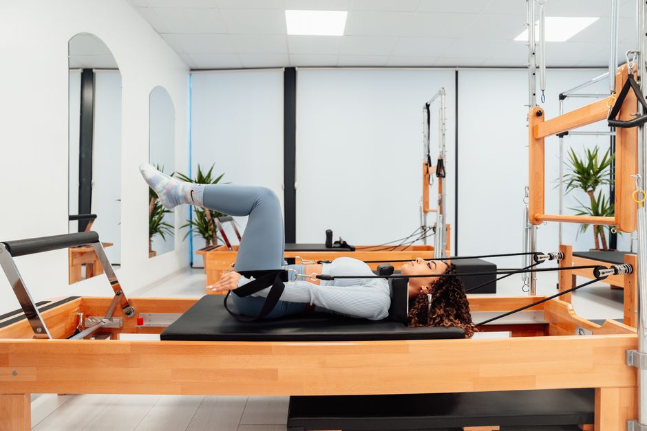
A Leeds mat studio and a Bristol reformer boutique that repaired the first screen
A multi-site mat brand in Leeds was spending steadily on search for “yoga for beginners” and a fixed-price two-week pass. Clicks looked healthy. Front-desk notes told a different story: callers asked whether classes were suitable for absolute beginners, and online, most sessions never reached the payment step. The mechanism was blunt. The campaign URL opened the main timetable filtered to “all levels”, with the intro price buried in a blog post from the previous January.
They built a dedicated landing page with the two-week pass in the headline, three beginner class times for the coming week, instructor photos, and a four-field form that created the guest profile automatically. They moved a strip of reviews that mentioned “nervous first timer” directly under the price. Within roughly 11 days of swapping the final URL in Google Ads, completed intro checkouts rose from a weak 2.4% of landing sessions to 9.1% on the same keywords (anonymised client data, Oct 2024, same keyword set, n=~1,400 sessions). Media settings barely changed. The page finally matched the query.
In Bristol, a reformer boutique had the opposite texture of problem. Their Meta creative was strong, and the Instant Form filled nightly. Almost nobody finished booking on site. Recordings showed the classic pattern: people landed, scrolled past a full-width video that took several seconds to become interactive, opened the membership comparison table, then left when the taster class was only linked from a tiny text line in the footer.
The fix was operational, not brand-new creative:
-
Strip the autoplay video from the paid landing template and replace it with a still of the actual studio floor plus a 12-second optional clip below the fold.
-
Put “£29 taster, no membership required” in the first screen with VAT-inclusive wording.
-
Move the guest checkout above the unlimited membership grid.
-
Add a one-tap call button for evenings when the online diary showed peak classes full.
-
Watch five abandoned sessions a day until the new friction points were obvious.
Taster completion on mobile traffic rose from ~3.1% to 9.4% over 14 days, and reception stopped manually re-explaining the offer on every callback. The lesson travels: your ten-second problem is almost always a specific mismatch you can name, not a vague need for “better branding”.
When your own recordings show the same stall points, tighten the offer block before you widen budgets. Scaling spend into a confused first screen only buys you more expensive bounces.
What UK studio owners say changed their intro booking rate
A pattern we see repeatedly in client feedback: studios keep blaming Meta when CPMs creep up, but the recordings show people never got past an 8-second hero film on iPhone. Killing the autoplay moves intro bookings before another ad is touched.
Another recurring theme: the breakthrough comes from putting the beginner series price and next three class times above the fold on the paid landing page. Same keywords, same bid strategy, far fewer “is this for beginners?” emails.
Action checklist

Free tools
DIY free tools for this playbook
Run these on the pages and campaigns this article covers, then fix what they flag before you scale spend or content volume.
Run these on this playbook
If the checklist shows a leak you cannot close in-house, request a free marketing audit.
Frequently asked questions
Do Yoga and Pilates studios in the UK still need dedicated landing pages if the main site looks polished?
Yes, whenever the traffic arrives with a specific intent such as an intro price, a beginner course, or a neighbourhood taster. A polished homepage still forces first-timers to decode membership language and full timetables. Dedicated pages protect message match from ad or search snippet through to checkout and make testing honest.
What should load in the first screen on mobile?
Location or studio name, the exact offer the visitor clicked, beginner suitability in one plain line, price inclusive of VAT if you display packages, a primary book or enquire control, and at least one concrete trust cue such as a recent review snippet. Secondary story can wait below.
How fast should reception follow up abandoned enquiries?
Same evening whenever someone starts a booking after work. Many UK buyers compare two or three studios in one sitting. A short human message that confirms level, kit, and the next open beginner slot recovers people who stalled on payment or account creation.
Where does behaviour insight fit if we already have Google Analytics?
Analytics tells you that a step dropped. Recordings and heatmaps show whether the cause was a frozen widget, a price surprise, or a timetable that looked advanced-only. Use both. Quantify the leak, then watch the session that explains it.
Should every class type get its own page?
Give separate pages to the offers you actively promote and the intents that pay for acquisition: intro packs, beginner courses, reformer tasters, postnatal, and distinct sites if travel time matters. Long-tail workshop pages can stay lighter. Do not clone thin pages for every minor timetable variant.
Putting it to work
Pull the last 30 days of mobile sessions on your highest-spend intro or beginner URLs and watch ten complete recordings end to end, noting the exact second people hesitate, rage-tap, or leave. Change one primary friction point on that template this fortnight, whether it is offer clarity, form length, or a slow above-the-fold asset, and measure completed bookings rather than clicks alone.
If you want a partner to own that first-ten-seconds experience end to end, from offer-matched landing pages through behaviour insight and iterative CRO for Yoga and Pilates studios in the UK, HeyLead can take the build and optimisation load so you stay focused on teachers, timetable, and community. Start a conversation at [email protected].
Free marketing audit, or reach Martin directly:
Get a free audit Chat with us on WhatsApp · [email protected]