
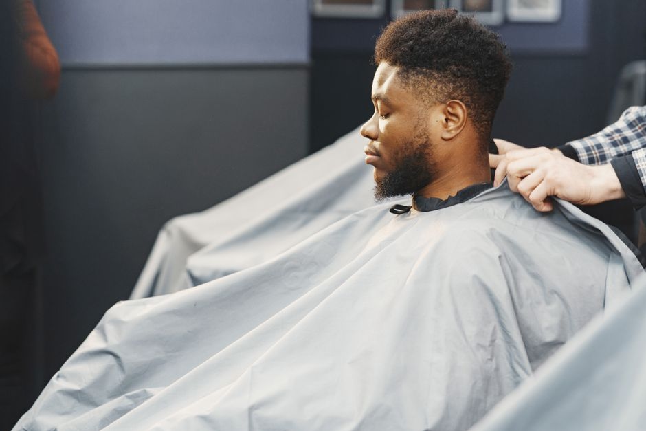
Barber landing page conversion checklist for the UK
The man who searched “skin fade Manchester” at lunchtime already has three tabs open. Yours is one of them. He will decide in under forty seconds whether your page feels like a real shop he can book today or another brochure with a generic contact form and stock photos of scissors.
That is the reality for barbers across London, Birmingham, Leeds, Bristol, and Glasgow. High-intent demand is not the scarce resource. Booked chairs are. Paid search, Google Business Profile clicks, and Instagram traffic all land on pages that still ask people to “get in touch” instead of choosing a service, seeing proof, and locking a slot. If you run ads or rank for local barber terms and the diary still has holes, the leak is usually the page, not the channel.
This is a self-audit for UK barber operators running paid search or local campaigns who want fewer wasted clicks and more confirmed appointments. Score yourself, find the leaks, then prioritise fixes that move booking rate, not vanity metrics.
When high-intent barber traffic fails before anyone phones
UK clients do not browse barber sites for inspiration the way they scroll hair accounts on Instagram. They type “barber near me”, “beard trim [city]”, or “walk-in fade today” because they need a cut in a specific window. Many of them are on a phone between meetings, after the gym, or on the bus home. They care about three things almost immediately: can you do the style they want, can they get in soon, and do you look like a proper shop rather than a template.
Where this breaks is predictable. You send “best barber Leeds” traffic to a homepage that opens with a full-width hero video, a long brand story, and a menu buried under a hamburger icon. Or you run Meta traffic to a page that still talks about “our passion for grooming” while hiding prices, parking, and walk-in policy. Form fields ask for company name and “how did you hear about us” before anyone can request a Saturday slot. On mobile, the page takes long enough to load that half the session is already gone before the first photo of a fade appears.
Response speed compounds the damage. Someone submits a form at 12:40 p.m. asking about a skin fade after work. If the shop only checks the inbox after close, that person has already booked the competitor who showed next-day availability on the first screen. Tracking gaps make it worse: ads report conversions while the front desk never saw the enquiry, or phone calls from the landing page are not tied back to the campaign, so you keep pouring budget into traffic that never becomes a chair.
None of this is fixed by “more leads”. It is fixed by a page built for one job: turn local intent into a booked visit with as little friction as possible. If you are already spending on search or social and the conversion step feels soft, a focused pass on web and landing page design usually pays back faster than another campaign restructure.
Score your barber landing page before you buy more clicks
Treat this as a working audit, not a brand exercise. Open your main booking or lead page on a phone, on normal UK 4G, not office Wi-Fi. Pretend you are a new client who found you through Google or an ad. Give yourself a harsh score out of five on each block below. Anything scoring two or below is a leak you should fix before you raise budgets.
First screen (above the fold). Can a stranger tell within three seconds that you are a barber shop in their city, what services you offer, and what to do next? You need a clear headline with location or neighbourhood language, one strong photo of real work (not a stock handshake), and a primary action: Book now, Check availability, or Call the shop. If the first thing people see is a logo animation or a paragraph about heritage, mark yourself down.
Service clarity and price cues. UK clients compare. They want to know whether you do skin fades, beard trims, hot towel shaves, kids cuts, or colour, and roughly what they will pay. You do not need a full VAT-inclusive menu on every creative, but landing pages that hide all pricing force people to call just to find out they are outside their budget. List core services with starting prices in GBP where you can. Note walk-in versus appointment policy in plain English.
Proof that feels local. Reviews with neighbourhood detail, before-and-after photos of real clients, barber names and specialties, and Google rating callouts beat generic “trusted by thousands” lines. If your best proof lives only on Google Business Profile or Instagram, pull a tight selection onto the page so the visitor does not have to leave and never come back.
Mobile speed and layout. Mobile drives most local search and paid clicks, yet conversion still lags when pages are heavy. Compress hero images, kill autoplay video above the fold, and keep the booking path visible without endless scroll. If Core Web Vitals are weak, you are paying for impressions that bounce before the form paints.
Form and call friction. Count the fields. Name, mobile number, preferred service, and preferred day or time is usually enough. Optional notes can sit below. Offer click-to-call for people who would rather talk, and make the number sticky on mobile. If you use Instant Forms on Meta, still send warmer traffic to a dedicated page that matches the offer, or you will train the algorithm on enquiries that never show up.
Write your scores down. The lowest two items are your first sprint. Do not try to redesign the whole site because a homepage feels dated. Fix the page that receives paid and high-intent organic traffic first.
Get a free marketing audit - we review your search, ads, and landing pages and send back what to fix first.
Get a free audit
Proof blocks and trust signals UK clients actually check
Barber trust is visual and social. People want to see the cut on heads that look like theirs, not a polished brand film. Put three to six recent cuts near the top, labelled with the style (skin fade, taper, beard shape-up) rather than vague captions. If different barbers have different strengths, say so. “Marcus takes the precision fades; Amir handles beards and longer styles” reduces the fear of a bad match.
Reviews should read like they came from your city. A short block quoting “booked a Saturday fade in Shoreditch, in and out in 40 minutes” beats a wall of five-star widgets with no context. Show the Google score if it is strong, and link out only after you have already given enough proof on-page. Opening hours, address with a simple map, parking or tube notes, and whether you take card only or cash help too. These details sound mundane until you realise how many shop pages omit them while competing shops put them in the first scroll.
Hygiene and professionalism signals matter more than owners admit. Clean shop photos, visible PPE or towel process if that is part of your standard, and a calm explanation of how appointments work all lower anxiety for first-timers. For multi-location groups in places like London or Manchester, do not send every ad to a single national homepage. Match the landing page to the branch the person can actually reach, with that shop’s phone number and hours. National pages that force a city dropdown after the click quietly burn spend.
Offer structure belongs here as well. “First visit fade and finish from £X” or “weekday lunch slots available” gives the page a reason to convert now. Keep the offer honest and easy to fulfil. Overpromising free add-ons you resent delivering will show up in reviews faster than it shows up in ROAS.
Mobile speed, form design, and watching where people abandon
You can pass the “looks fine on my laptop” test and still lose the lunchtime phone visitor. Start with the technical basics: image weight, third-party scripts, and anything that delays Interaction to Next Paint on mobile. A page that eventually looks sharp but takes several seconds to become usable will lose the comparison shopper who already has two other barbers open. Aim for a page that feels instant on a mid-range Android, because that is a large share of real traffic.
Forms deserve the same ruthlessness. Every extra field is a decision. “Company” and “website” have no place on a barber booking page. Postcode can help routing for multi-site brands, but only if you use it. Preferred barber is useful if staffing is real; otherwise it creates false expectations. Confirmation should be immediate: thank-you state with what happens next, expected callback window, and a click-to-call fallback if nobody replies within your promised time.
Guesswork is optional once you can see behaviour. Session recordings, heatmaps, and scroll depth show whether people stall on the price block, bounce when the gallery is slow, or rage-tap a button that is not tappable. That is exactly where HeyLead Insights earns its keep for barber pages: you stop arguing about taste and start fixing the step where intent dies. Pair that with clean conversion events (form submit, click-to-call, booking complete) so Google Ads and Meta are not optimising on soft micro-clicks that never become chairs.
If paid traffic still lands on a homepage “because that is what we have”, stop. Dedicated landing pages aligned to the ad or keyword cluster almost always beat a general site tour. Message match is simple: if the ad promised a skin fade from a clear price point in Birmingham, the page should open on that promise, not a carousel of unrelated services. For broader positioning and channel mix around shops like yours, see HeyLead’s notes on barbers marketing once the conversion path itself is tight.
Two UK shop scenarios where the page fixed the diary
Independent shop, Leeds city fringe. The owner was spending roughly £900 a month on Google Ads for fade and “barber near me” terms. Clicks looked healthy. The diary did not. The landing page opened with a 12-second muted video, no prices, and a six-field contact form that emailed a shared inbox checked twice a day. The fix was narrow: replace the hero with a still of a real skin fade, add starting prices for the three most booked services, cut the form to four fields, and add a sticky call button. They also set a 15-minute callback rule during open hours.
Within three weeks, the same spend produced fewer total form fills but more shows. The mechanism was not “better branding”. It was removing the lag between intent and a human response, and proving price before the call. Cost per booked cut dropped because the page stopped attracting tyre-kickers who only wanted a free consultation chat.
Two-chair shop group, south Manchester and Stockport. Instagram and a small Meta budget drove traffic to one shared homepage. Heatmaps later showed most mobile visitors never reached the booking widget; they stopped at an outdated gallery that took too long to load. Branch phone numbers were buried in a footer. The team split traffic: each ad set pointed to a location page with local reviews, that shop’s hours, and a short “next available” note updated weekly by the manager. They compressed images and moved the booking CTA above the fold.
Bookings shifted toward the correct chair capacity instead of overloading one site. The useful lesson is operational: multi-location barber brands need location-matched landing pages and proof, not a single brand story with a map pin at the bottom. If you only change creative and keep one weak URL, you will keep paying to educate people who leave.
-
Pick the one URL that receives the most paid or GBP traffic.
-
Rewrite the first screen for service, area, and action.
-
Add price cues and three local proof elements.
-
Cut form fields and add click-to-call.
-
Watch sessions for a fortnight and fix the first abandon point you see.
Patterns we see in audits
The short quotes below are illustrative composites drawn from patterns in account reviews. They are not quotes from named clients.
“We kept blaming Google Ads CPCs in London until we watched five mobile sessions in February on Microsoft Clarity. Nobody could find the price of a skin fade without scrolling past three paragraphs about our ‘culture’. Once prices and a Book button sat in the first screen, the same keywords started filling Saturday again - waitlist by week three.” - Owner, independent barbers, London
“Form fills looked fine in Meta. The shop floor said half never answered. Turns out the landing page thanked them and promised a reply ‘shortly’ with no time attached. We put a two-hour callback window on the page and actually staffed it. Show rate jumped from about 50% to roughly three in four without touching the creative.” - Head of Marketing, multi-site barbers group, North West England
Free tools
DIY free tools for this playbook
Run these on the pages and campaigns this article covers, then fix what they flag before you scale spend or content volume.
Run these on this playbook
If the checklist shows a leak you cannot close in-house, request a free marketing audit.
Frequently asked questions
Do barbers in the UK still need a dedicated landing page if Google Business Profile is strong?
Yes, if you run ads or care about campaign-level conversion. GBP wins map pack visibility and calls, but paid traffic and many organic clicks still land on your site. A dedicated page lets you match the offer, track properly, and control proof and pricing in a way the listing alone cannot.
Should we show prices if competitors undercut us?
Show starting prices for core services. Hiding everything filters fewer people and fills the phone with budget mismatches. If you are premium, say what is included and why. Clarity converts better than mystery for local services booked in minutes.
How fast should we respond to a landing page enquiry?
During open hours, treat it like a walk-in at the door. Aim to call or message within 15 minutes when you can, and publish a realistic window on the thank-you state. After hours, an auto-reply with next open time and a booking link stops people shopping the next tab.
Should we use a third-party booking system like Fresha or Treatwell instead of a contact form?
Often yes, if no-shows and phone tag are eating chairs. UK clients already know Fresha and Treatwell, and you get real-time availability, deposits, and reminders in one flow. A short contact form still works when you reply within minutes and the offer is simple, but do not send high-intent ad traffic to “we’ll call you back” if the shop already runs on a booking tool-embed or link that tool on the landing page and make the CTA match how you actually take appointments.
What should we track beyond form submits?
Track click-to-call, booking completions, and, where possible, kept appointments. Form volume without show rate will fool you into scaling the wrong traffic. Tie CRM or diary outcomes back to source so you can cut keywords and ads that only generate no-shows.
Putting it to work
Pull the last 30 days of enquiries from your main barber landing page and mark each one booked, no answer, or wrong fit. Then open that same page on your phone and score first screen, proof, price cues, speed, and form length against the checklist above. Fix the single lowest score this fortnight: most shops find it is either missing prices, a slow hero, or a form that asks for too much before offering a time.
Over the next 30 days, run a simple sequence. Week one: first-screen rewrite and image compression. Week two: proof and GBP-style reviews on-page, plus field cuts on the form. Week three: call tracking and thank-you messaging with a real response window. Week four: watch behaviour with session insight, then adjust the first abandon point. Keep ad and organic spend steady while you do this so you can see whether conversion rate moved, not just traffic.
If you want a partner to own the conversion leaks between click and booked chair, including page structure, proof layout, and behaviour-led fixes through tools like HeyLead Insights, HeyLead can take that landing page programme off your plate. Message us on WhatsApp.
Free marketing audit, or reach Martin directly:
Get a free audit Chat with us on WhatsApp · [email protected]